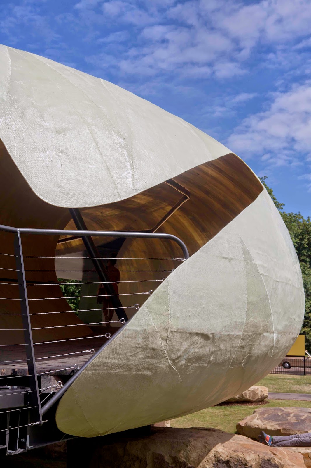
I am delighted to share some of my recent photographs
from a shoot at the Serpentine Pavilion. The text below gives lots
of information about this years Summer Pavilion including information on the architect – Text taken from The Serpentine Gallery website – enjoy!
(The full edit of images are available for usage through
www.viewpictures.co.uk)
Chilean architect Smiljan Radić has designed the
fourteenth
Serpentine Pavilion which opened 26 June until 19th
October 2014
Radić is the fourteenth architect to accept the
invitation to design a temporary Pavilion outside the entrance to the
Serpentine Gallery in Kensington Gardens. His design follows Sou Fujimoto’s
cloud-like structure which was visited by almost 200,000 people in 2013 and was
one of the most visited Pavilions to-date.
Occupying a footprint of some 514 square metres on the
lawn of the Serpentine Gallery, plans depict a semi-translucent, cylindrical
structure, designed to resemble a shell, which rests on large quarry stones.
This work has its roots in the architect’s earlier work, particularly The
Castle of the Selfish Giant, inspired by the Oscar Wilde story and
the Restaurant Mestizo - part of which is supported by large
boulders.
The 2014 Pavilion is designed as a flexible,
multi-purpose social space with a café sited inside. Visitors will be
encouraged to enter and interact with the Pavilion in different ways throughout
its four month tenure in the Park. On selected Friday nights, between July and
September, the Pavilion will become the stage for the Galleries’ Park
Nights series, sponsored by COS: eight site-specific events bringing
together art, poetry, music, film, literature and theory and including three
new commissions by emerging artists Lina Lapelyte, Hannah Perry and Heather
Phillipson.
Smiljan Radić has completed the majority of his
structures in Chile. His commissions range from public buildings, such as
the Civic Neighbourhoods, Concepción, Museo Chileno de Arte
Precolombino, Santiago, Restaurant Mestizo, Santiago, and the Vik Winery,
Millahue, and domestic buildings, such as Copper House 2, Talca, Pite
House, Papudo, and the House for the Poem of the Right Angle, Vilches, to
small and seemingly fragile buildings, such as the Extension to Charcoal
Burner's House,Santa Rosa, The Wardrobe and the Mattress, Tokyo, Japan,
and The Bus Stop Commission, Kumbranch, Austria.
Considerate of social conditions, environments and
materials, Smiljan Radić moves freely across boundaries, avoiding any specific
categorisation within one field of architecture. This versatility enables him
to respond to the demands of each setting, whether spatial constraints of an
urban site or extreme challenges presented by a remote rural setting,
mountainous terrain or the rocky coastline of his native Chile.
AECOM will again provide engineering and technical
design services as it did for the first time in 2013. In addition, AECOM will
be acting as cost and project manager for the 2014 Pavilion. While this is the
second Serpentine Galleries Pavilion for AECOM, its global chief executive for
building engineering, David Glover, has worked on the designs for a majority of
the pavilions to date. The Serpentine Galleries are delighted that J.P. Morgan
Private Bank are the co-headline sponsor of this year’s Pavilion.
Architect's statement:
"The Serpentine Pavilion 2014 continues a history
of small romantic constructions seen in parks or large gardens, the so-called
follies that were popular from the late sixteenth century to the beginning of
the nineteenth century.
In general, follies appear as ruins or have been worn
away by time, displaying an extravagant, surprising and often archaic form.
These characteristics artificially dissolve the temporal and physical limits of
the constructions into their natural surroundings. The 2014 Pavilion takes
these principles and applies them using a contemporary architectural language.
The unusual shape and sensual qualities of the Pavilion
have a strong physical impact on the visitor, especially juxtaposed with the
classical architecture of the Serpentine Gallery. From the outside, visitors
see a fragile shell in the shape of a hoop suspended on large quarry stones.
Appearing as if they had always been part of the landscape, these stones are
used as supports, giving the pavilion both a physical weight and an outer
structure characterised by lightness and fragility. The shell, which is white,
translucent and made of fibreglass, contains an interior that is organised
around an empty patio at ground level, creating the sensation that the entire
volume is floating. The simultaneously enclosed and open volumes of the
structure explore the relationship between the surrounding Kensington Gardens
and the interior of the Pavilion. The floor is grey wooden decking, as if the
interior were a terrace rather than a protected interior space.
At night, the semi-transparency of the shell, together
with a soft amber-tinted light, draws the attention of passers-by like lamps
attracting moths.


No comments:
Post a Comment